Work Index
(2022)
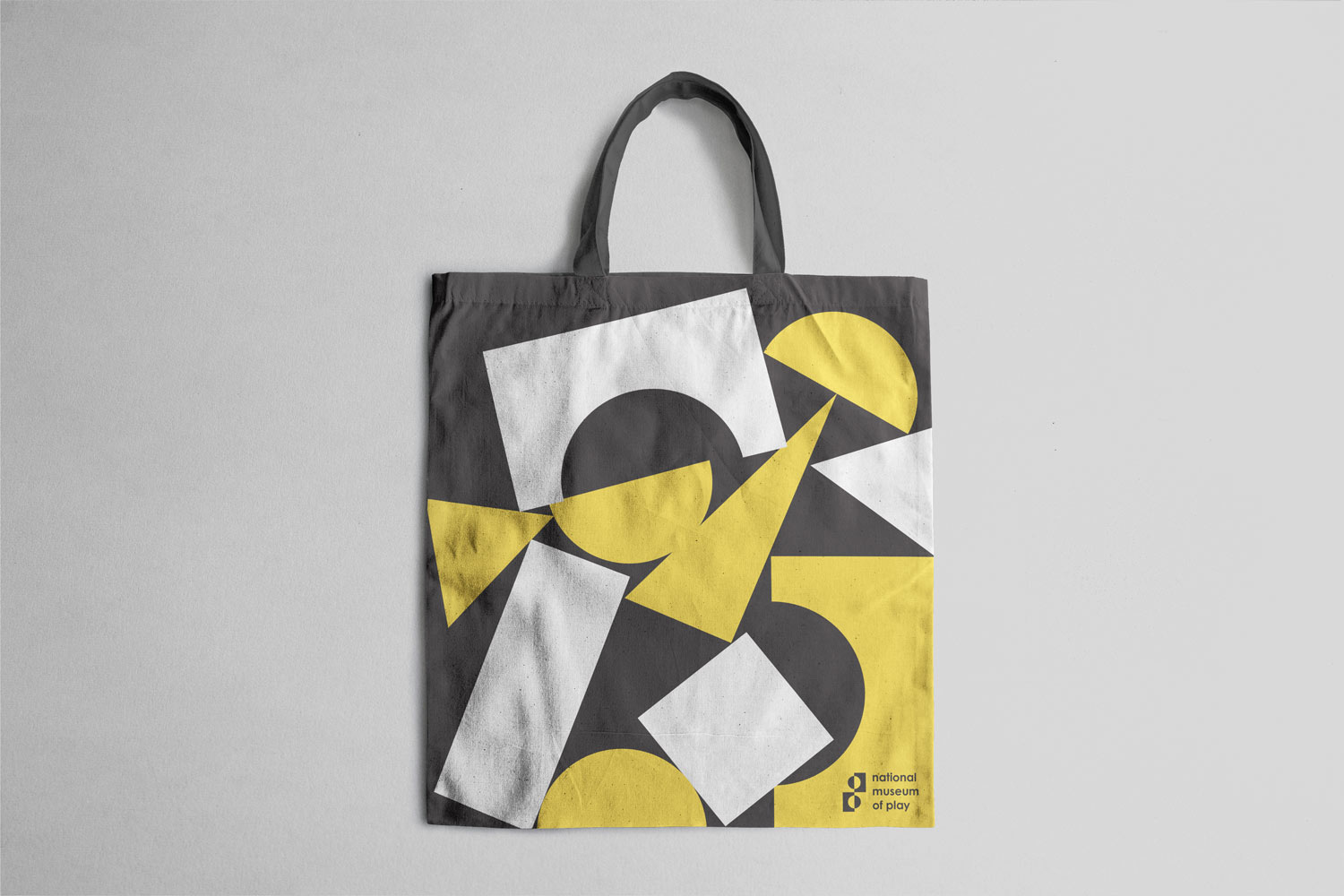
national museum of play
For the rebrand of the Museum of National Play, I focused on creating an identity that balances joy and professionalism. The logo incorporates a vibrant yellow, symbolizing playfulness and positivity, while maintaining a sophisticated tone. Inspired by the iconic Melissa and Doug wooden building blocks, the shapes within the logo represent the importance of learning and development through play in childhood. This rebrand reflects the museum’s mission to foster creativity, imagination, and education in a dynamic and engaging way.
branding
redesign
(2024)
design theory zine
For this project, I created a design history/theory zine that encapsulated my projects from my design theory class and tied them together with a common conceptual theme.
editorial
design theory
(2023)
triton
Triton is a wild-caught Mediterranean seafood brand offering fresh, never frozen seafood. From shrimp to sea bass, Triton’s commitment to quality and sustainability ensures a premium dining experience. Designed for health-conscious foodies, the brand captures the vibrant flavors and artisanal spirit of the Mediterranean.
branding
packaging

(2025)
to kill a mocking bird
For my To Kill a Mockingbird book cover design, I created a striking, textural composition by cutting out leaves to form the silhouette of an upside-down dead bird. This design symbolizes the novel’s themes of innocence lost, fragility, and the consequences of prejudice, using natural materials to evoke a raw, organic feel that ties to the story’s Southern setting
book cover design

(2024)
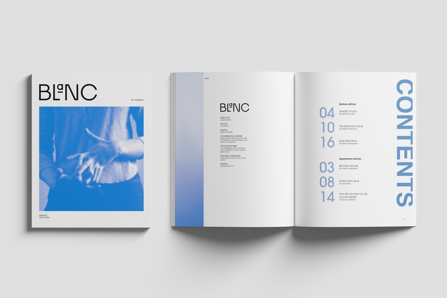
blanc magazine design
For this project, I created a concept for a culture magazine titled Blanc, which explores color theory and its influence in art, design, and visual culture. Each issue of the magazine is dedicated to a single color, examining its emotional impact, historical symbolism, and practical use in creative fields. The issue I designed focused on blue, highlighting how artists and designers implement blue tones to evoke mood, create depth, and convey meaning. The overall design aims to be both educational and visually immersive, establishing a strong identity for the ongoing series.
editorial
(2023)
saintlo ottawa rebrand
A playful and inviting rebrand for Saintlo Ottawa Jail Hostel, designed to celebrate its unique history as a former jail while appealing to modern travelers. The identity features a curious raccoon mascot, a bold red-and-black color palette, and a series of whimsical spot illustrations that highlight guest experiences, from quiet time to breakfast. The rebrand includes logo design, custom illustrations, and icons to create a memorable guest experience.
branding
illustration

(2023)
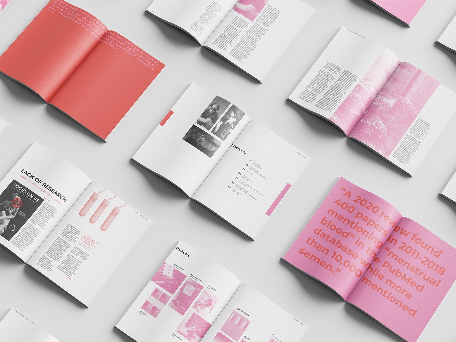
call to action poster
This call-to-action poster challenges the FDA's approval of loose guidelines for the displayed ingredients on menstrual products, harmful tampon ingredients, and critiques the broader systemic neglect of menstrual health. Using classical sculpture imagery interrupted by modern, provocative elements, the piece draws attention to the lack of research, transparency, and education surrounding feminine hygiene products. The design uses visual irony and bold typography to demand safer standards and amplify the voices of those most affected.
editorial

(2024)
koko bee chocolate
KoKo Bee is a Brazilian chocolaterie that infuses regional honey varieties directly into its chocolate, creating bold, floral flavor profiles. The branding captures the company’s organic, playful, and adventurous spirit through a vibrant color palette, expressive type choices, and a whimsical yet modern aesthetic inspired by the natural richness of Pará, Brazil.
branding

(2022)
national museum of play
branding
redesign
(2024)
design theory zine
editorial
design theory
(2023)
triton
branding
packaging
(2025)
to kill a mocking bird
book cover design
(2024)
blanc magazine design
editorial
(2023)
saintlo ottawa rebrand
branding
illustration
(2023)
call to action poster
editorial
(2024)
koko bee chocolate
branding